Ameba launched blog ranking pages using AMP Stories this year. Our goal was to provide more attractive content for a mobile-first audience. As this AMP case study shows, the business metrics were better compared to our regular page:
- 20% Link Click Ratio
- 53% Story Completion Ratio
- 1.5x Average Page Duration
The key factor of the achievement was a collaboration between designers and developers. The two types of creators helped each other, shared their experiences, and then made a beautiful stories.
Today, I am going to show you the process we develop the stories and the important points for a better user experience. An article on technical stack will be published by @RyuichSakagami later.
Improving Quality With Prototypes
The stories project began as a small team, but we have created a lot of prototypes to improve user experience for both bloggers and audience. During the period, we have learned some techniques regarding story format.
Animations For Reading Content
At the beginning of the project, we thought better quality come from animations. We also believed that we can grab users’ hearts with the transitions. However, we soon realized that animations were not useful for reading content. Users were eager to read text as soon as possible in our user testing with various prototypes.
This shows a mistake we discovered that people do when they actually do something for the first time. For instance, when making a first presentation with Keynote app, people tend to use too many animations in their slide. This is the early prototype below. We thought the animation is tricky and blocks users to read content. Finally, we decided to remove the animations from the critical content.
Prioritizing Visual Content
Story format is a good place for visual content like images and videos. The audience can consume the content as it is in a full screen experience. On the other hand, images need to be resized in a typical list format, and it is hard to play videos in such a small area.
We think AMP Stories is one of the best formats to display a tons of visual content posted by our bloggers in an efficient way. Our challenge is always making blog entries more attractive, and then helping the audience understand the entry.
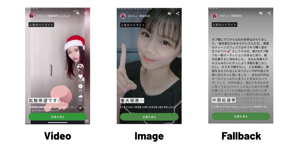
Videos can be a killer content in story format. In a story with videos, the audience can consume the content on the page without any interactions. We came up some rules for what types of visual content should be displayed in a page listed below.
- Automatically play videos if the entry has videos
- Display images if the entry has large images
- Display summary text as a fallback content
Turning On Auto Advanced Mode
Whether to use auto advanced mode or not depends on your site. Turning it off makes sense in most cases like news article, recipe and travel reviews. In those stories, the audience want to read content at their own pace.
But, we tried to turn on the mode to assist the audience reading our ranking content like a video experience. They can consume the content without any interactions. Of course, they also can move to another page by tapping edge side if they feel the page is taking too long.
In our stories, auto advanced duration is set to 5 seconds for a page with images and text background. For a video page, we set the video duration as auto advanced duration. This is the example of our story below.
Implementations For Better User Experience
AMP Stories is an implementation on the web, so traditional techniques such as server optimization, image optimization and critical path optimization are useful. In addition to those techniques, there are some tips for “media-first” content.
Preloading Critical Resources In The First Page
AMP Stories starts displaying content after AMP scripts have been fetched and evaluated, and then starts fetching content in a page. This means that sometimes media content could not display due to network latency.
Preloading critical resources can be a good idea to help displaying them soon. In our stories, images on the first page are critical resources. The images are preloaded by link element in HTML, and can be fetched before the AMP script has been executed.
Reducing Data Consumption On Save Data Mode
AMP Stories tends to consume data heavily due to its full media experience. Some videos and large images can be displayed on the page. We need to take care whether the audience wants to use their data budget or not at the time.
Ameba provide “save data mode” stories. Auto advanced mode is disabled if HTTP request header has “Save-Data: on” or the URL includes “save-data=on” query. The header can be added when data saver mode is turned on in some browsers. Audience can access the stories with the query when network connection or device CPU is poor.
Ensuring Accessibility More Than Normal Page
Accessibility is a fundamental thing for the Web. Everyone can access websites with a link. Story format is new, more dynamic and more focused on visual materials compared to typical websites. But we need to ensure accessibility in the format as well.
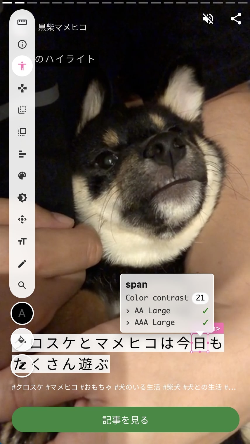
Color contrast ratio would be a big topic for accessibility in story format. Text tends to be displayed above visual materials and it sometimes could be hard to ensure a sufficient contrast ratio due to some visual design reasons. However, we think critical text like the title should meet WCAG level AA at least. Highlighting text can be a useful technique in this case.
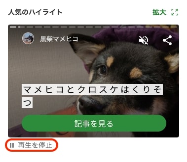
We guess the audience may be frustrated when they see moving materials that they do not want to see. In this case, the product team should provide a way to pause the animations. We added a stop animation button to our website. AMP team seems to add play/pause button in AMP Stories.
The user preference setting is a treasure for improving user experience. We can get the preferences from “prefer-*” rules in the media features. We can increase color contrast ratio if prefers-contrast is sWe can reduce animations if prefers-reduced-motion is set “reduce”. The AMP team is planning to apply this as animations tend to be added a lot in story format.