
- Layout Shift Has UX Problems
- Monitoring “Cumulative” Layout Shifts
- Finding Layout Shift Reasons
- Strategy For Layout Shift Improvements
- Layout Shift Patterns
- Conclusion
Layout Shift Has UX Problems
Users may be frustrated if layout shifts happen while reading content. For example, they might tap a button unintentionally when the layout has changed due to a new banner appearing at the top of the page. Another example is that they may lose their position in the page if the new element above pushes the content out of the viewport.
As a result, conversion rates may drop and the web site loses the user’s trust. This is a UX problem, so the service team should minimize change of layout shifts as much as possible.
Monitoring “Cumulative” Layout Shifts
Cumulative Layout Shifts is a score for measuring the UX problem. The score reveals the impact from layout shift in a session. This is one of the statistics provided by Core Web Vitals, which is useful for providing a better user experience on your website.
Measuring “Cumulative” layout shifts might be a little tough. The score requires user interaction such as scrolling down to the bottom of the page or tapping some elements to open a drawer. This means developers should collect the value from dynamic actions.
We collected the score with real user monitoring and in local development with the web vitals library. In the real world, we send scores and the specific element names as the additional attributes to Firebase Performance. We output them as warning logs in local development.
![This is a screenshot of console in DevTools. The web-vitals.log library outputs normal log like "⏰ Web Vitals Log: Good LCP 0.92s [reference to the entry]" when the metrics is good. That also outputs warning log when a value exceeding its threshold is detected. This example shows the layout shift attribution including the target element, previous rect and current rect.](https://developers.cyberagent.co.jp/blog/wp-content/uploads/2020/12/cls-log.jpg)
Finding Layout Shift Reasons
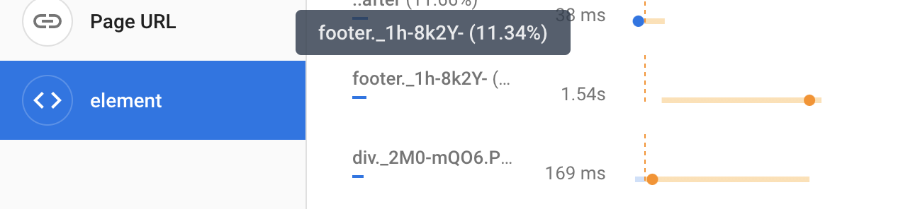
The first step to find the layout shift reason is to detect each layout shift with the performance observer. The entries in the performance observer have the necessary information such as the target element, previous rectangle, current rectangle etc. The web-vitals.log library can be useful for outputting them.
You should determine whether the target element itself has a layout shift problem or not. If the difference between the previous and current rectangle is dimensions (height or width), the reason may be inside the element. If the difference is position (x or y), the sibling elements may be affecting the target element.
DevTools have some useful features for discovering the reason. The experience section in the performance tab displays CLS summary. Throttling to a slow network can be useful to find elements that do not have placeholder content. Blocking a response can detect elements that do not have fallback content.
Strategy For Layout Shift Improvements
The metrics data should be collected before starting improvement. This can help you to understand the problem and to divide them into some small groups of issues. Also you can see how your improvements affect the score.
The priority may not be the same for all the pages on your site. The data in your monitoring tool reveals which pages are worse than other pages. You should start improvements from the most important pages for your site.
You don’t need to improve layout shift problems perfectly. Ideally the score gets 0, but improvement from 0.3 to 0.1 has a big UX benefit. Small improvements always ensure a better quality experience for your users.
Layout Shift Patterns
We found some reasons behind the layout shift. The following patterns help you to understand the reason and to improve them when you meet a new layout shift issue.
Unsized media
The most common pattern is lack of element aspect ratio. The width and height should be set to the elements such as <img> and <iframe>.
NOTE: You should make an aspect ratio box for responsive images and iframes. However setting the correct values for width and height are critical as most browsers are going to calculate aspect ratio from the values.
Multi-size Element
When multiple size elements are expected to be inserted into an area, the space should be kept for the maximum size element. For example, If 300px and 400px height elements can be displayed, 400px + margin is the most ideal height of the area.
TIPS: The predicted minimum height can also help reduce CLS value when the element height is variable. For example, when the image width is 660px and the height might be from 260px to 350px. The maximum CLS is around 0.2 on a 740px height screen if the element has no height, but the value can be reduced to around 0.03 if you set the minimum height like min-height: 40vw in CSS.
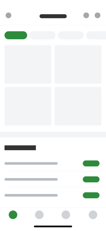
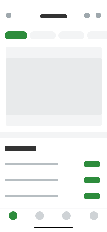
Placeholder and Fallback
Placeholder and fallback are very important for modern apps. A lot of data is fetched via XHR on the client side asynchronously. Layout shifts also could happen asynchronously without placeholders and fallbacks.
These elements should be prepared to the same size with the element displaying the result. You can create the skeleton while the data is being requested, and display a message with a retry button when the request has been failed.
Infinite Scroll with Footer
I rarely see infinite scroll with a footer in native apps, but sometimes see it in web apps. If an infinite scroll starts after the footer is displayed, users can’t tap the element. The team should consider whether infinite scroll is appropriate for the content, or whether it can be put in another area, or whether the content is important.
In my opinion, infinite scroll is too aggressive for some types of content. The service can also use paging navigation for situations where users don’t wish to see much content in the situation or it is necessary for a large amount of data such as image or video gallery to be seen.
You can also add a footer after the last content in the infinite scroll has been displayed. This might be a tricky solution, but it’s a considerable option if both infinite scroll and footer are critical for your service.
Sticky Headers
Using only CSS would be better if you want to make sticky headers. In a typical implementation with JS, some spaces have to be added when reaching the sticky position. CSS position:sticky is now widely supported in modern browsers, so it’s time to make smoother sticky headers without layout shifts with CSS.
Conclusion
We have been trying to reduce the CLS score from 0.3 to 0.1 at 75 percentile with a lot of small improvements. This is labeled as good CLS in Core Web Vitals. To notify regression, we began to send summaries to Slack on a daily basis with the CrUX API and Google App Scripts. (example code)
We believe collaboration among teams makes good products. To improve CLS, we must discuss plans not only with developers, but also designers, product managers, Ad-sales and so on. I hope this article provides some useful tips to you and your team.